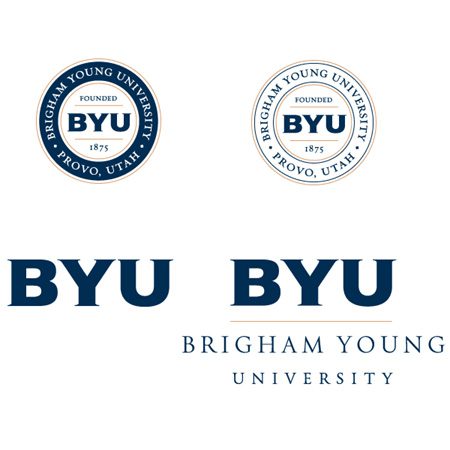
The new logos, including (clockwise, beginning at top left) the medallion, alternate medallion, combined mark (work mark and monogram together), and monogram, retain a traditional collegiate feel and provide name recognition.
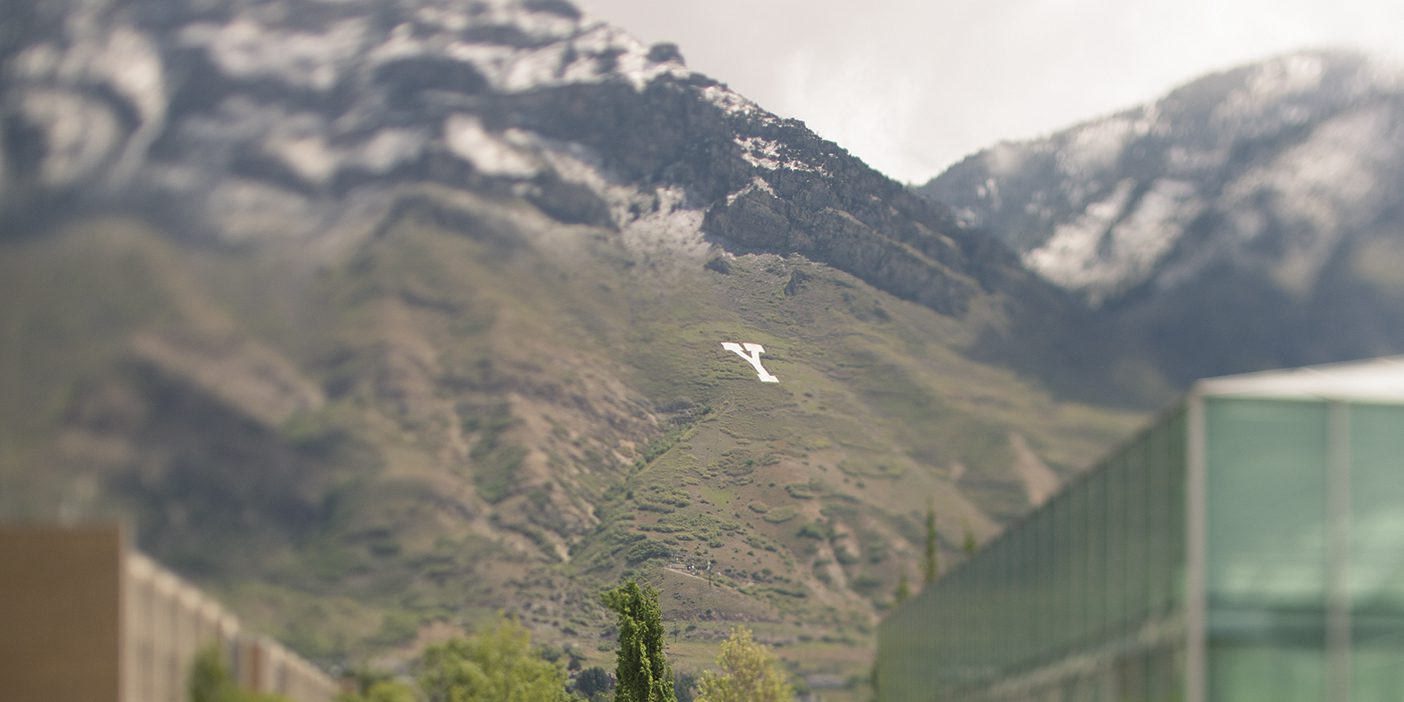
THE three schools that share the Brigham Young University name are now tied together visually through an identity system of new word marks, monograms, medallions, and seals.
“Our objective was to create an identity system that reinforces the shared roots of the three institutions, while allowing enough flexibility for individual educational emphases,” says Merrill J. Bateman, BYU president. “We are especially pleased with the subtle parallels in the design that provide a visual link to our sponsor, The Church of Jesus Christ of Latter-day Saints.”
Eric B. Shumway, ’64, president of BYU—Hawaii, agrees. “This new identity design communicates a sense of unity and shared purposes among all of the campuses of Brigham Young University. It suggests the importance of one university, three campuses. Each campus may have its own personality and mission but will remain linked in terms of the larger mission of the Church.”
“The name Brigham Young University—Idaho has given our new baccalaureate institution immediate national and international recognition,” explains David A. Bednar, ’76, president of BYU—Idaho. “We are pleased and honored to be linked spiritually, academically, and now visually with Brigham Young University.”
“We appreciate the thought and energy that went into this extensive creative effort,” adds John C. Lewis, ’77, BYU‘s associate advancement vice president. “We are pleased to introduce a family of trademarks that quickly and clearly communicates the dignity and supportive relationship of these three institutions.”
The family of marks that will begin to appear this fall represents a collaboration among the three schools. It offers an integrated BYU look for each school while allowing for some distinction with the school’s full name as well as its color.
In Provo the BYU logos carry deep blue and white with a tan accent, consistent with its athletic logos and marks, which were unveiled in 1999. The BYU—Hawaii logo retains its traditional red and gold colors, which are considered royal colors in Hawaiian culture and integral to the institution’s identity. The BYU—Idaho logo is royal blue with silver accents, the traditional identifying colors for Ricks College.
“The new marks are the result of 18 months of careful research and evaluation to see how we could do a better job with our institutional identity system,” Lewis says. “We began by looking at BYU‘s identity alone and were later joined by BYU—Hawaii. BYU—Idaho was added to the mix after the public announcement that Ricks College would change its name. The three schools worked well together, resulting in the emergence of a set of identifying marks that offer quick and enduring recognition worldwide.”
Lewis coordinated the identity design in conjunction with the BYU Board of Trustees and administrators at all three campuses.